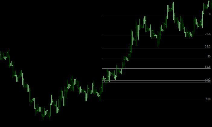
The Fibonacci retracement is a basic technical analysis tool used to predict price movements in any asset class.
It is drawn using two extreme points or swing points on a chart and adding the Fibonacci levels or ratios between them. A swing point is a price cluster that forms a “V” shape (inverted or otherwise) as seen in the charts below. The main Fibonacci levels to keep in mind are 0%, 38.2%, 61.8%, and 100%. 100% is the starting swing point (lowest price level), while 0% marks the end of a swing or price move (highest price level).
In analyzing charts, this tool can be used in two basic ways:
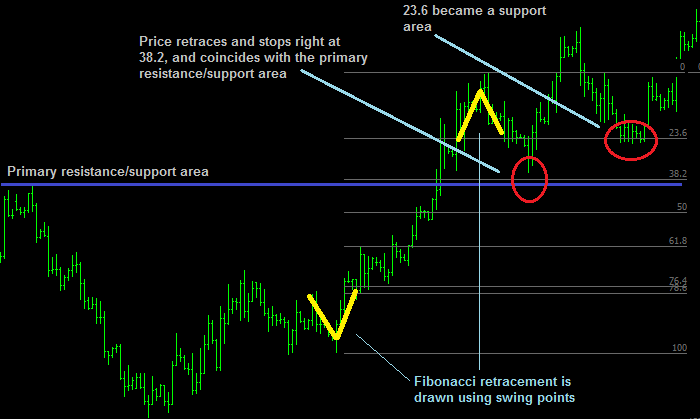
The main use of this indicator is in detecting support and resistance areas in a chart ahead of time. The following chart shows a Fibonacci retracement acting as support during a price uptrend (first at the 38.2% level and subsequently at the 23.6% level).
Meanwhile, for those traders who prefer to draw their own (primary) support and resistance areas (blue horizontal line on the chart), they would find that Fibonacci retracements tool can help draw or identify additional support and resistance areas, which sometimes even coincide with primary ones as seen below.
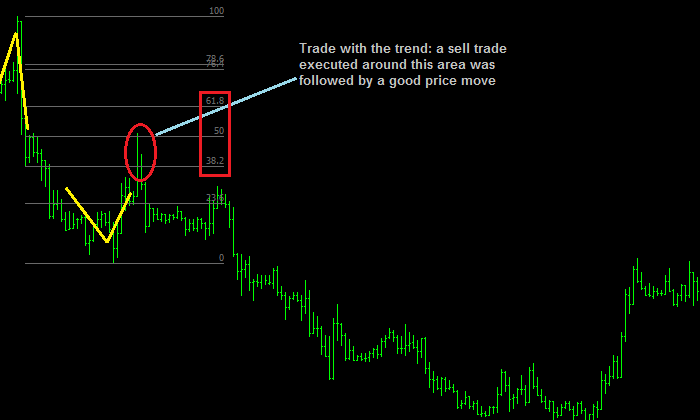
Since the Fibonacci calculator can be used to project support and resistance areas, it can also detect potential buying and selling areas. For example, if a trader is looking to buy into an uptrend, he can look at levels 38.2%, 50%, and 61.8% as buying areas (and selling areas in a downtrend). If one is a counter-trader (or trading against a trend), those same three levels can be used as potential trade exit areas. An example trend trade and countertrend trade are shown below.
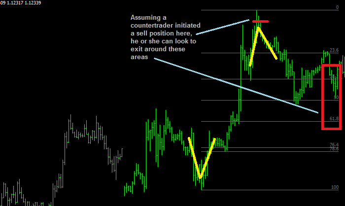
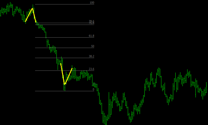
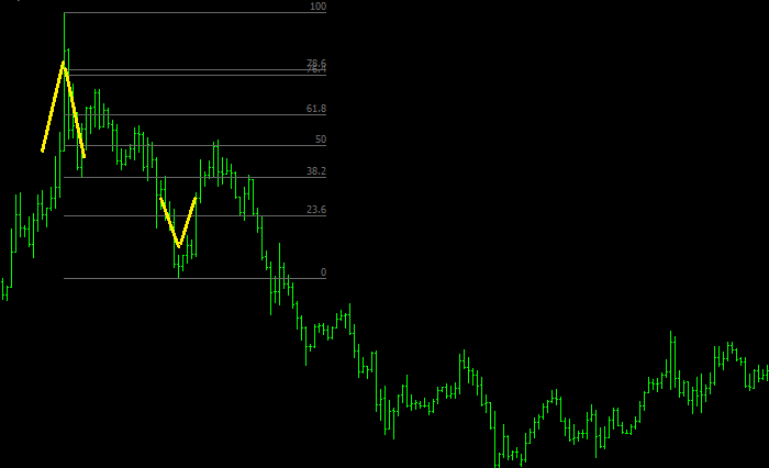
Some beginners get caught up with what specific level to use: is it 76.4 or 78.6? Some even prefer to use 76.3. The general answer is: it doesn’t matter, because these levels are very close to each other. Traders should focus more on the proper use of this tool, and less on finding out the exact areas or numbers. Consider the charts below where 76.4 and 78.6 levels have been plotted on top of each other on hourly and daily charts. You would notice that both levels are very close to each other, hence the difference is very minimal (9 pips on the hourly chart and 35 pips on the daily chart) and mostly immaterial for many traders. Since they are close to each other, it’s easier on the eye to use only one. Some charting platforms allow you to delete the labels or levels (if you find that necessary). The important thing is to keep it simple as much as possible.
Get the latest fundamental analyses, technical analyses and the most up to date Forex news catered to your interests.